Hello Coders, Today’s article we are going to learn about components in AEM, types of aem component and why it is required to learn and where it can be used, these are some questions that we are going to explore and try to find out their answers. We’ll learn each and every concept of component so that you remember this concept for long time and use it during implementation.
What is Component in AEM ?
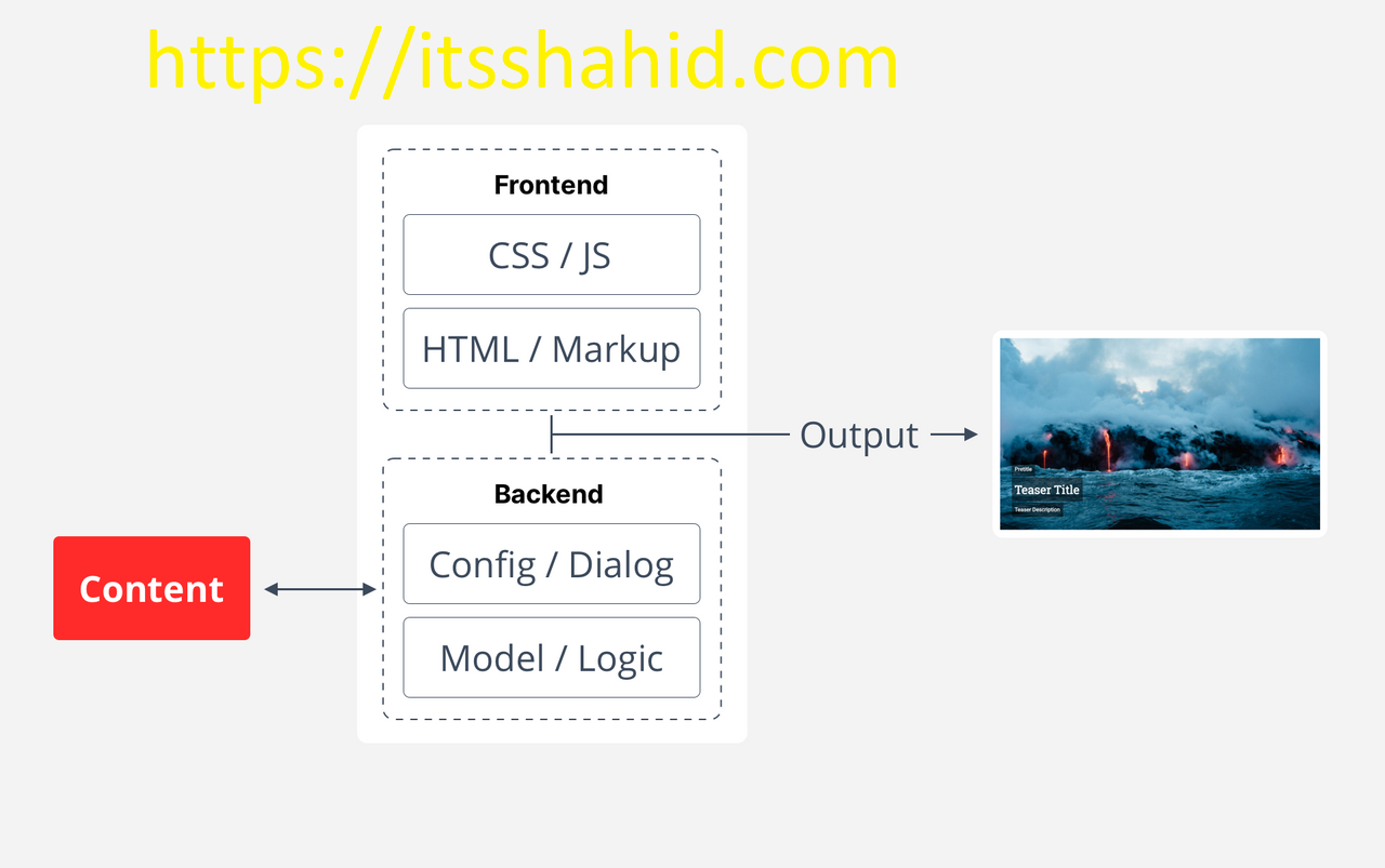
So, component is a piece of code which represent a feature or a small section of a Page. This can be anything like a form, a card, a header, a table etc. So component is nothing, but it is a feature which can implement in a page or experience and content fragment. Now component in AEM is same as creating a component in any other framework or technology and creating component and configuring a component is different because AEM gives many out of box component or we can simply inherit many component very easily. Lets see the below picture to more understand the component architecture
So you are now familiar with architecture of the Component in AEM on the above picture
Way To Create Component
Types of Component in AEM and way to create
- Static AEM Component
- Authorizable AEM Component
- Dynamic AEM Component
1) Static AEM Component
We can create component for testing purpose like how our component is looking and how can we test. Basically we can not actually use it in a page but we can test our component so that we’ll sure to this component that it is working as expected or not.
AEM gives a special area or we can say a specific static page so we can design and test our components.
Steps to create Static Component
- Go to your ui.frontend folder and under src/main/webpack you’ll see static folder click it.
- A file will visible with index.html, just open it.
- Under body section design your component and remove all stylesheet and js code.
- Again go to ui.frontend folder and right click on component folder and create a scss file with component related name.
- Write html and write your scss and save it.
- Open terminal under ui.frontend and run: npm run dev.
- Wait and after successful compilation.
- Again in same terminal run npm run start, this will start a server at any other port to test and view your component.
- Now check and redesign and just save the code it will automatically compile and reload the page.
- That’s it.
So, finally, there will be only two files you need to write code, one for html(index.html) and one for scss(_yourconponent.scss)
Let’s take an example for better understand
I am creating a component which look like below screenshot and for example, I have named this component as: herocomponent, I am not focusing on designing part because we are not reading scss designing tutorials.
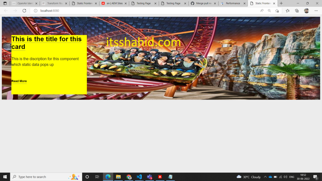
So, in below demonstration whenever I’ll call herocomponent then it will reflect this component.
index.html
<!DOCTYPE HTML>
<html lang="en">
<head>
    <meta charset="UTF-8"/>
    <title>Static Frontend file</title>
    <meta name="template" content="page-content"/>
    <meta name="viewport" content="width=device-width, initial-scale=1"/>

</head>
<body style="margin: 10px;" class="page basicpage">

<div class="cmp-homepagehero">
    <img src="https://media.tacdn.com/media/attractions-splice-spp-674x446/0b/34/18/5f.jpg" class="cmp-homepagehero__image" alt="FNL_Hero Image.png">
    <div class="cmp-homepagehero__card">
      <div class="cmp-homepagehero__card-body">
        <h1 class="cmp-homepagehero__card-title"><a href="#"
            class="cmp-homepagehero__card-title-link">This is the title for this card</a></h1>
        <div class="cmp-homepagehero__card-description">This is the discription for this component which static data pops up
        </div>
        <div class="cmp-homepagehero__card-button-wrapper">
          <a href="#" class="cmp-homepagehero__card-button">Read More</a>
        </div>
      </div>
    </div>
</div>
</body>
</html>_herocomponent.scss
.cmp-homepagehero {
    margin-top: 10px;
    position: relative;

    &__card {
        bottom: 5px;
        left: 50px;
        margin-top: 68px;
        position: absolute;
        top: 5px;
        width: 400px;
    }

    &__card-right {
        bottom: 5px;
        margin-top: 68px;
        position: absolute;
        right: 50px;
        top: 5px;
        width: 400px;
    }

    &__card-body {
        background-color: $color-rp-yellow;
        height: 315px;
        margin-bottom: 10px;
    }

    &__card-title {
        color: $color-rp-black;
        font-size: 35px;
        font-weight: bold;
        line-height: 41px;
        padding-bottom: 0px;
        padding-top: -1px;
        text-decoration: none;

        &-link {
            border-bottom: 1.5px solid $color-border-bottom;
            color: $color-rp-black;
            text-decoration: none;

            &::after {
                border-color: $color-border-bottom;
                transition: all 1.5s ease-in-out border-color;
            }

            &:hover {
                border-color: rgb(1, 0, 4);
                border-bottom: 1.6px solid $color-rp-black;
                color: $color-rp-black;
                cursor: pointer;
                transition: all 1.5s ease-in-out border-color;
            }
        }
    }

    &__card-button {
        border-bottom: 1px solid $color-border-bottom;
        color: $color-rp-black;
        display: inline-block;
        font-weight: bold;
        margin-top: 41px;
        text-decoration: none;

        &::after {
            background: $color-rp-black;
            color: $color-rp-black;
            content: '';
            display: block;
            height: 1px;
            transition: width .3s;
            width: 0;
        }

        &:hover::after {
            color: $color-rp-black;
            transition: width 1.3s;
            width: 100%;
        }
    }

    &__card-description {
        font-size: 20px;
        margin-top: 30px;
    }

    &__card-button-wrapper {
        color: $color-rp-black;
        margin-top: 20px;
    }

    &__image {
        height: 440px;
        width: 100%;
    }
}
2) Authorizable AEM Component
The name meaning itself, that is we can authorize data for the component and we can set, reset data as per our requirements. All data will be handle By JCR and it can be edit and delete as per AEM jcr rule.
Authorizable can make your component reusable with data changes support. Suppose you want same component style, but want to change their data then you can make the component authorizable and change it as per requirement
Some rules are given by the AEM to create component and make it authorizable
Steps to create Authorizable Component
- Firstly, we need to create a folder under ui.apps\src\main\content\jcr_root\apps\wknd\component.
- As our component name is:herocomponent, created folder name herocomponent under component folder(we can use crx console also).
- There will some files and required folder need to create.
- Create a two file under your herocomponent folder that is: herocomponent.html and .content.xml.
- Create a CQ Dialog folder under your herocomponent folder: _cq_dialog , please name it as I write.
- Create a file under cq dialog folder name it: .content.xml (So basically for simple component there will be two .content.xml files one is under _cq_dialog folder and other direct component folder but remember this is a simple component which is I am taking for example there can be many cq folder like cq config etc).
- Under your _cq_dialog folder .content.xml holds all the structure for the dialog like how our dialog look like and what will be input fields etc.
- Thats it.
Let’s Understand these step in more explainable way with above example
Lets take example of hero component so now we need to create a folder with component name and our component name is herocomponent
Now Under this folder create some files and folder
file 1: .content.xml
file 2: herocomponent.html
folder1: _cq_dialog
Under _cq_dialog
file1: .content.xml
So basically 3 files and 1 folder will be created
————–Let’s Understand Why these required and what are their uses————–
- herocomponent/.content.xml : So basically I added herocomponent/ to understand hierarchy, to reduce confusion among .content.xml. This file have all the meta data of the particular component.
<?xml version="1.0" encoding="UTF-8"?>
<jcr:root xmlns:cq="http://www.day.com/jcr/cq/1.0" xmlns:jcr="http://www.jcp.org/jcr/1.0"
    jcr:primaryType="cq:Component"
    jcr:title="Hero Component"
    componentGroup="Wknd Sites Project - Content"/>
So from the above code, we seeing some information of the component like:
jcr:primaryType=”cq:component” this shows that is component data node
jcr:title=”Hero Component” this shows the title of the component and reflect it in our dialog box so that we can choose the component accordingly.
componentGroup=”Wknd Sites Project – Content” this shows group which is list down in dialog component list under this particular group.
- herocomponent/herocomponent.html : In this file we’ll write our html for the component(remember index.html) and in index we defined a main container div which shows that we can cut and copy to our code in hero component
<div class="cmp-homepagehero">
    <img src="${properties.background}" class="cmp-homepagehero__image" alt="FNL_Hero Image.png">
    <div class="cmp-homepagehero__card">
      <div class="cmp-homepagehero__card-body">
        <h1 class="cmp-homepagehero__card-title"><a href="${properties.link}"
            class="cmp-homepagehero__card-title-link">${properties.title}</a></h1>
        <div class="cmp-homepagehero__card-description">${properties.description}
        </div>
        <div class="cmp-homepagehero__card-button-wrapper">
          <a href="${properties.link}" class="cmp-homepagehero__card-button">Read More</a>
        </div>
      </div>
    </div>
</div>
Here, you notice that I have used ${properties.background} and other field, but previously we had some static data. but now here we have changed static data and place this code. So basically this is a SIGHTLY (HTL) expression to put the data from the JRC which already authorized.
- herocomponent/_cq_dialog/.content.xml: In this file we write code for dialog layout, and how many field can be our CQ dialog. This is the main code where we make our component authorizable.
<?xml version="1.0" encoding="UTF-8"?>
<jcr:root xmlns:sling="http://sling.apache.org/jcr/sling/1.0" xmlns:cq="http://www.day.com/jcr/cq/1.0" xmlns:jcr="http://www.jcp.org/jcr/1.0" xmlns:nt="http://www.jcp.org/jcr/nt/1.0"
    jcr:primaryType="nt:unstructured"
    jcr:title="Hero Component"
    sling:resourceType="cq/gui/components/authoring/dialog">
    <content
        jcr:primaryType="nt:unstructured"
        sling:resourceType="granite/ui/components/coral/foundation/fixedcolumns">
        <items jcr:primaryType="nt:unstructured">
            <column
                jcr:primaryType="nt:unstructured"
                sling:resourceType="granite/ui/components/coral/foundation/container">
                <items jcr:primaryType="nt:unstructured">
                    <title
                        jcr:primaryType="nt:unstructured"
                        sling:resourceType="granite/ui/components/coral/foundation/form/textfield"
                        fieldLabel="Title (in 40 word)"
                        name="./title"/>
                    <background
                        jcr:primaryType="nt:unstructured"
                        sling:resourceType="granite/ui/components/foundation/form/fileupload"
                        allowUpload="{Boolean}false"
                        autoStart="{Boolean}false"
                        class="cq-droptarget"
                        fieldDescription="Select an image as background for the panel. Image height: 240px (min), 240px (max)."
                        fieldLabel="Background Image"
                        fileNameParameter="./background1"
                        fileReferenceParameter="./background"
                        mimeTypes="[image]"
                        multiple="{Boolean}false"
                        name="./backgroundimg"
                        required="{Boolean}true"
                        title="Upload Image Asset"
                        uploadUrl="${suffix.path}"
                        useHTML5="{Boolean}true"/>
                    <description
                        jcr:primaryType="nt:unstructured"
                        sling:resourceType="cq/gui/components/authoring/dialog/richtext"
                        fieldLabel="Description"
                        name="./description"
                        useFixedInlineToolbar="{Boolean}true">
                        <rtePlugins jcr:primaryType="nt:unstructured">
                            <format
                                jcr:primaryType="nt:unstructured"
                                features="bold,italic"/>
                        </rtePlugins>
                        <uiSettings jcr:primaryType="nt:unstructured">
                            <cui jcr:primaryType="nt:unstructured">
                                <inline
                                    jcr:primaryType="nt:unstructured"
                                    toolbar="[format#bold,format#italic,format#underline,links#modifylink,links#unlink]"/>
                                <icons jcr:primaryType="nt:unstructured">
                                    <bold
                                        jcr:primaryType="nt:unstructured"
                                        command="format#bold"
                                        icon="textItalic"/>
                                </icons>
                            </cui>
                        </uiSettings>
                    </description>
                    <link
                        jcr:primaryType="nt:unstructured"
                        sling:resourceType="granite/ui/components/coral/foundation/form/pathfield"
                        fieldLabel="Target Link"
                        name="./link"
                        rootPath="/content/rightpoint"/>

                </items>
            </column>
        </items>
    </content>
</jcr:root>
In the above code we designed dialog box for the component. If you see this in crx, You’ll see nodes and their items. So here are items : title, background, link, description. These are the fields.
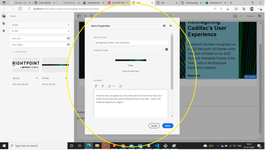
and Now after filling all the details your component is look like this one.
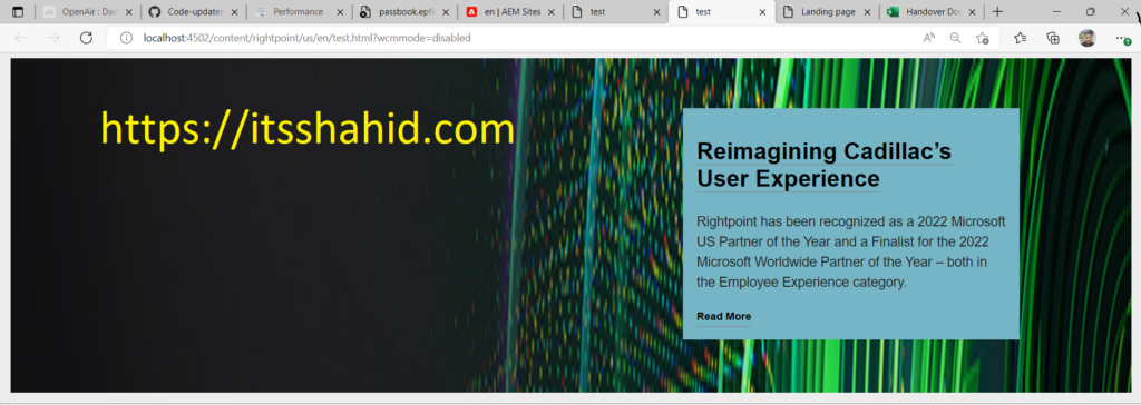
Hurray, All value has been set and up to date in html through ${properties.name} name. “name” is the field name of the dialog items.
3) Dynamic AEM Component
When we accessing and manipulating our dialog data through any medium/models then we achieve dynamic approach. So in simple when we use model instead of properties.name then the component is called dynamic component.
So for creating model in AEM we use java and Sling models(Sling Models are annotation driven Java “POJO’s” (Plain Old Java Objects) that facilitate the mapping of data from the JCR to Java variables, and provide a number of other niceties when developing in the context of AEM).
Steps to create Authorizable Component (hero component)
- Create Interface.
- Create Implementation Class.
- Use model in HTL.
- that’s it.
1). Create Interface:
So we need to create interface with component name under C:\aem\aem sites\wknd\core\src\main\java\com\wknd\core\components\models, in our example we have hero component.
HeroComponent.java
package com.wknd.core.components.models;
public interface HeroComponent{
    String getTitle();
    String getDescription();
    String getLink();
    String getBackground();

}
So basically, what I have written is just create some function and from name you can easily get what is it, Simply these are the functions which will implement and override in implementation class. I have created four functions for title, description, link, background.
Remember: If you made any changes, then Don’t forget to build the project by this command: mvn clean install -PautoInstallSinglePackage. Also Always keep function(method) name relevant and add get in very first.
For example, If you want title as method name, so when we create any method we need to create as getTitle(); . AEM given this rule and we can’t change it.
2). Create Implementation Class:
HeroComponentImple.java
So, here we implement our interface and use Sling for implementation.
package com.wknd.core.components.models.impl;

import org.apache.sling.api.SlingHttpServletRequest;
// import org.apache.sling.api.resource.Resource;
import org.apache.sling.models.annotations.Model;
import org.apache.sling.models.annotations.injectorspecific.ValueMapValue;

import com.wknd.core.components.models.HeroComponent;

import org.apache.sling.models.annotations.DefaultInjectionStrategy;
import org.apache.commons.lang3.StringUtils;

@Model(adaptables = { SlingHttpServletRequest.class }, adapters = { HeroComponent.class }, resourceType = {
    HeroAbstractImpl.RESOURCE_TYPE }, defaultInjectionStrategy = DefaultInjectionStrategy.OPTIONAL)
public class HeroComponentImpl implements HeroComponent {
    protected static final String RESOURCE_TYPE = "wknd/components/herocomponent";

    @ValueMapValue
    String title;

    @ValueMapValue
    String description;

    @ValueMapValue
    String background;

    @ValueMapValue
    String link;


    @Override
    public String getTitle() {
        return title;
    }

    @Override
    public String getDescription() {
        return description;
    }

    @Override
    public String getLink() {
        return link;
    }

    @Override
    public String getBackground() {
        return background;
    }

    // this method will return boolean for for setting component Name if data is empty
    @Override
    public boolean isEmpty() {
        return StringUtils.isBlank(title) && StringUtils.isBlank(description) && StringUtils.isBlank(link)
                && StringUtils.isBlank(background);
    }


}
3). Use Model In HTL(Sightly).
Now finally we can use model in our HTL. To use model in our HTL please follow below step:
Create reference of the model like: data-sly-use.model=”com.wknd.core.components.models.HeroComponent” and use this reference to set the value from the JCR->Model->HTL, have a look at code written below.
<div class="cmp-homepagehero" data-sly-use.model="com.wknd.core.components.models.HeroComponent">
    <img src="${model.background}" class="cmp-homepagehero__image" alt="background">
    <div class="cmp-homepagehero__card">
      <div class="cmp-homepagehero__card-body">
        <h1 class="cmp-homepagehero__card-title"><a href="${model.link}"
            class="cmp-homepagehero__card-title-link">${model.title}</a></h1>
        <div class="cmp-homepagehero__card-description">${model.description}
        </div>
        <div class="cmp-homepagehero__card-button-wrapper">
          <a href="${model.link}" class="cmp-homepagehero__card-button">Read More</a>
        </div>
      </div>
    </div>
</div>
Now, Your Dynamic Component is ready to use and again just Build the project through this command: mvn clean install -PautoInstallSinglePackage and export component in AEM Server
So, from the above code you can understand where and why model used in HTL. Click Here for HTL Tutorials
Some Frequently Ask Questions:
What are AEM components ?
Components are re-usable modules that implement specific application logic to render the content of our website. We can Authorize Component as per our need, AEM components help to make development easier.